
Marketing OS
Welcome Launch
The Welcome rebrand was officially launched in March 2021, following the introduction of the freemium program in late 2020. Prior to this, the platform was exclusively invitation-only and relied heavily on human intervention to onboard new users and set up demo environments for prospects. The PLG initiative inspired us to develop a more user-centric product.
In my role as design lead, I worked closely with product managers, designers, and engineers to achieve this transformation, resulting in a significant impact across the platform. We simplified the signup process, introduced interactive onboarding, updated the homepage, and completely revamped the work and planning experience.
⇒ 50% / 1,152 WAU YTD GROWTH
/ 2021-2022
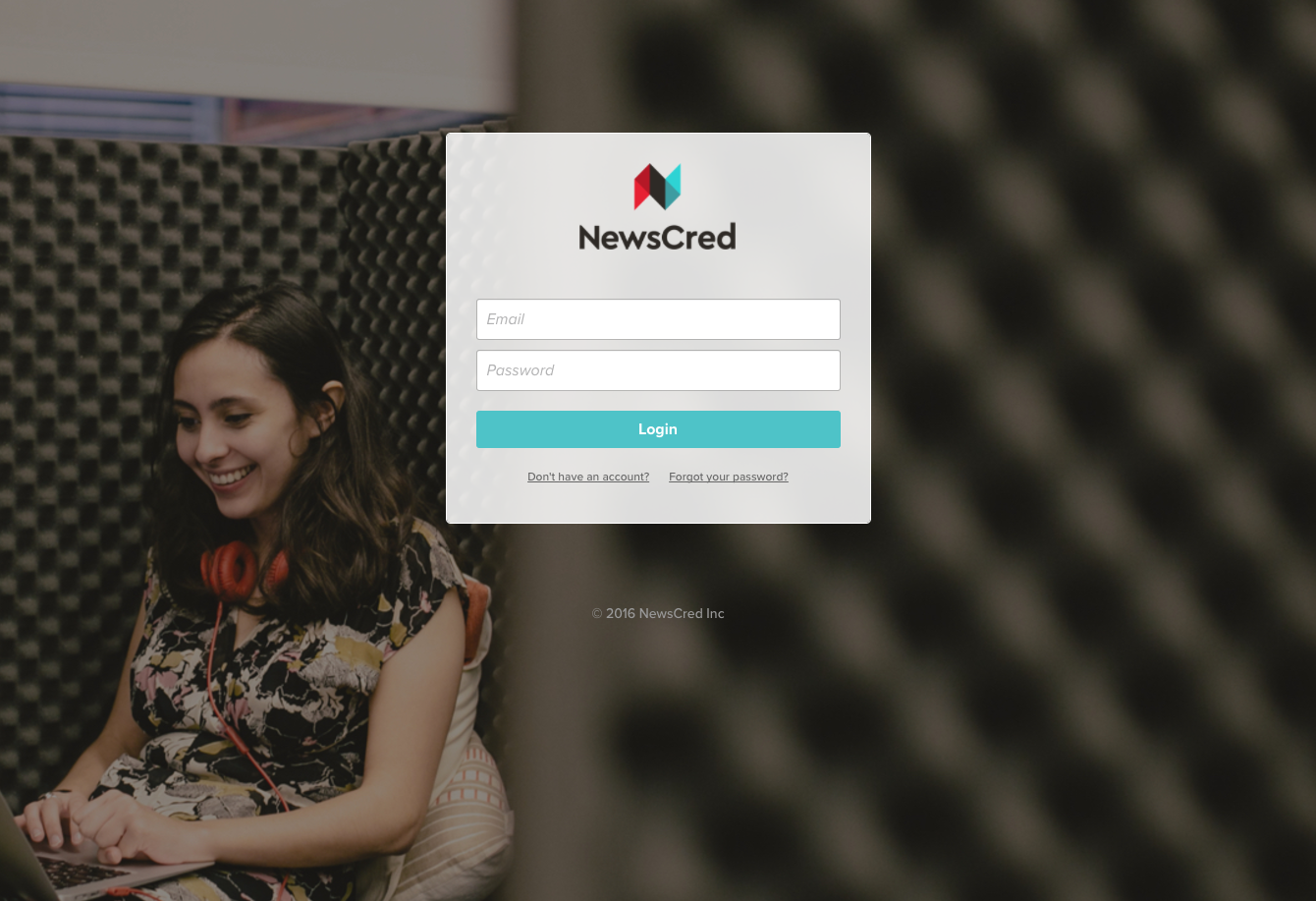
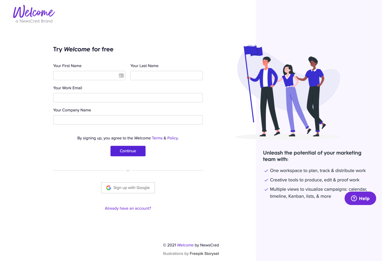
Free SignUp
Problem:
Prior to this, the platform didn’t facilitate individual customer sign-ups. The establishment and initiation of each workspace required direct intervention from our technical service team. This method was not only time-consuming but also prevented scale-up. In order to foster a product-led growth strategy, we need to remove the barriers to product use.
Solution:
We have streamlined the process of instance creation from our backend, making it possible for users to autonomously sign up and freely navigate through the tool. Furthermore, we offer a dynamic onboarding experience that walks new users through the platform. This enhancement not only saves valuable time and resources, but also significantly improves the accessibility of our platform to prospective customers.
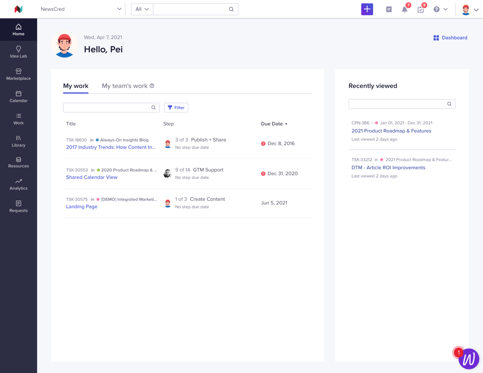
Homepage
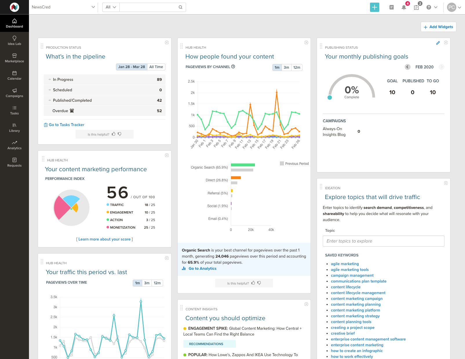
Problem:
The home page initially featured a widget-based dashboard. It was designed with the intention of offering an overview of various elements, including the performance of published content, team productivity in handling tasks, and the pace of advancement toward the organization’s content marketing objectives. However, feedback from the majority of users indicated a desire for a home screen that would facilitate a quick and easy way to identify their own tasks and work needs.
Solution:
Our freshly revamped home page is now distinctly tailored to cater to the needs of individual users instead of offering a universal overview applicable to the entire organization. Despite its focused scope, the homepage is loaded with enhanced features that empower users to smoothly track ongoing assignments, swiftly identify ensuing tasks, and continually maintain a grasp on their cumulative progress. Ultimately, this strategic revamp boosts usability, paving the way for our users to achieve elevated efficiency.
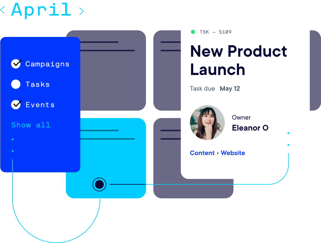
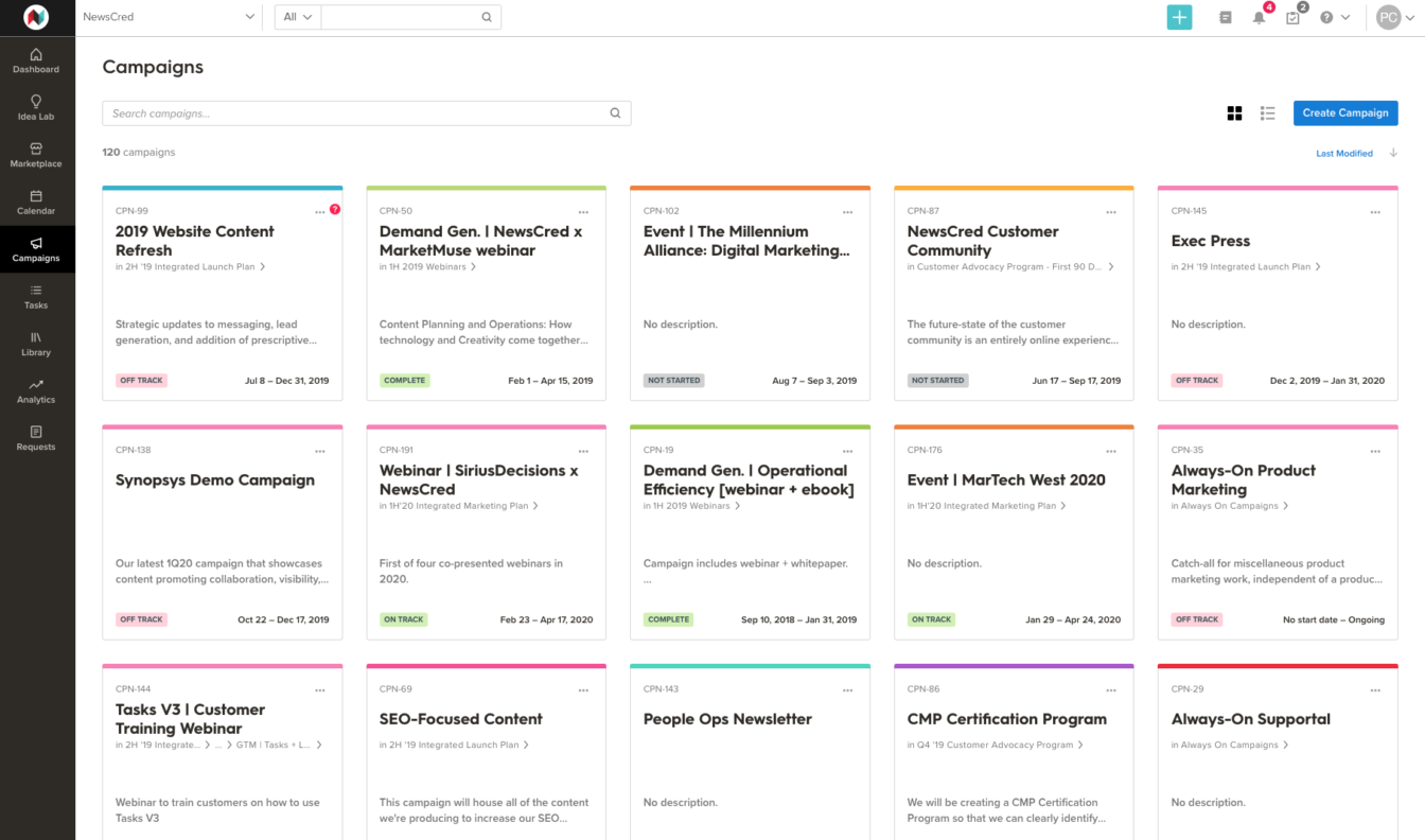
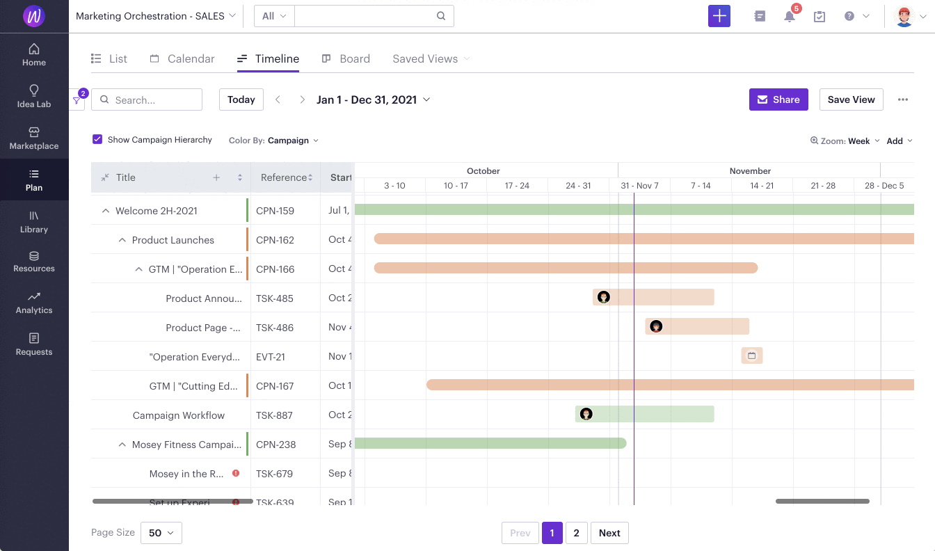
Plan
Problem:
The initial gallery presentation for campaigns on our platform boasted attractive visuals but fell short in terms of scalability. Correlated views, such as the calendar and kanban views, were scattered across different modules, leading to an inconsistent user experience. In addition, these views were not connected by the same query, creating inconsistencies in task outputs and provoking performance complications.
Solution:
We have unified related views into a solitary module dubbed the Plan. This module facilitates a cohesive filtering interface, enabling users to seamlessly toggle between list, calendar, timeline, and kanban views. It also provides the functionality for users to preserve and share their tailored views with their team. This streamlined methodology has dramatically ameliorated user interaction while mitigating performance complications.
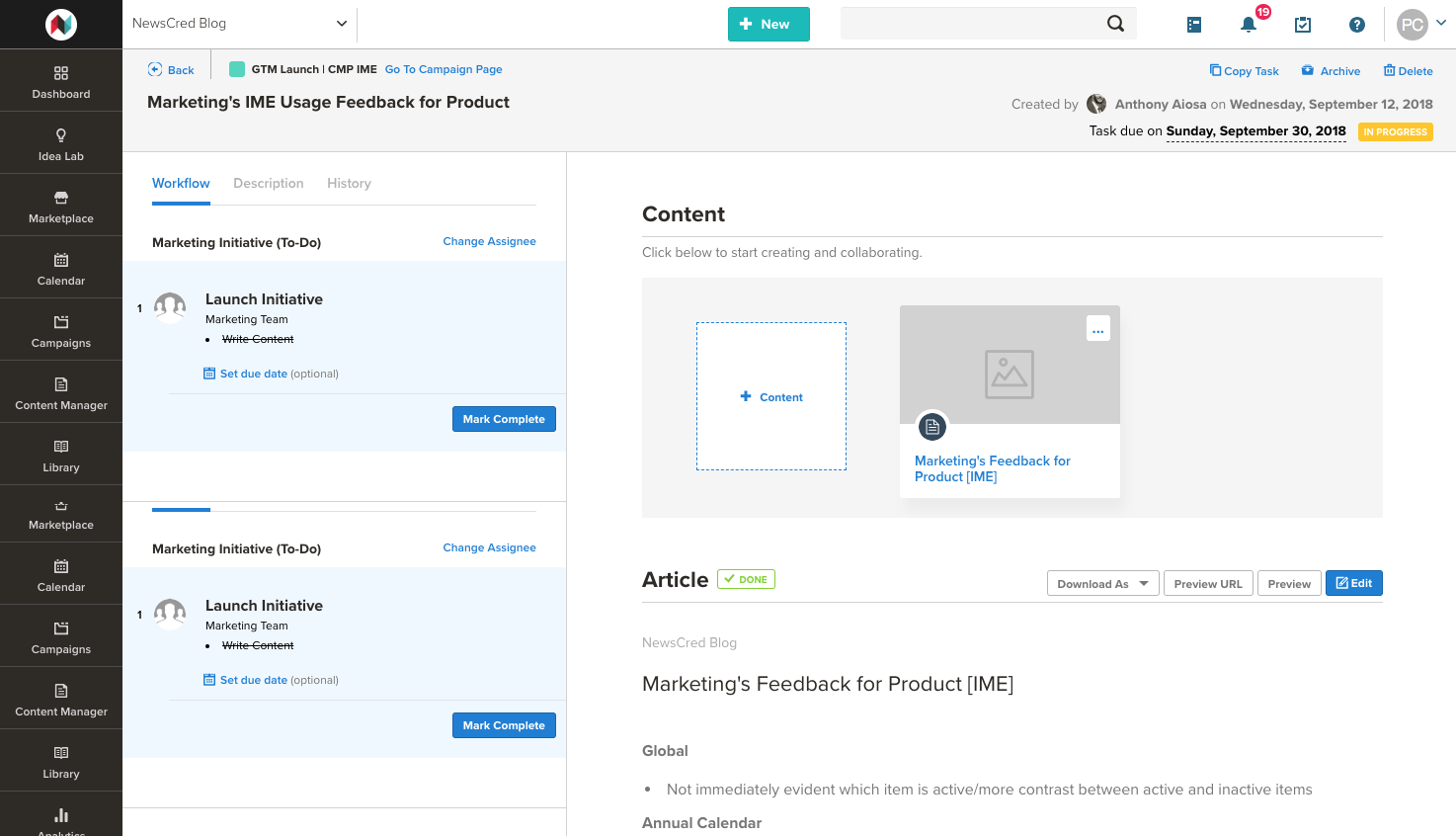
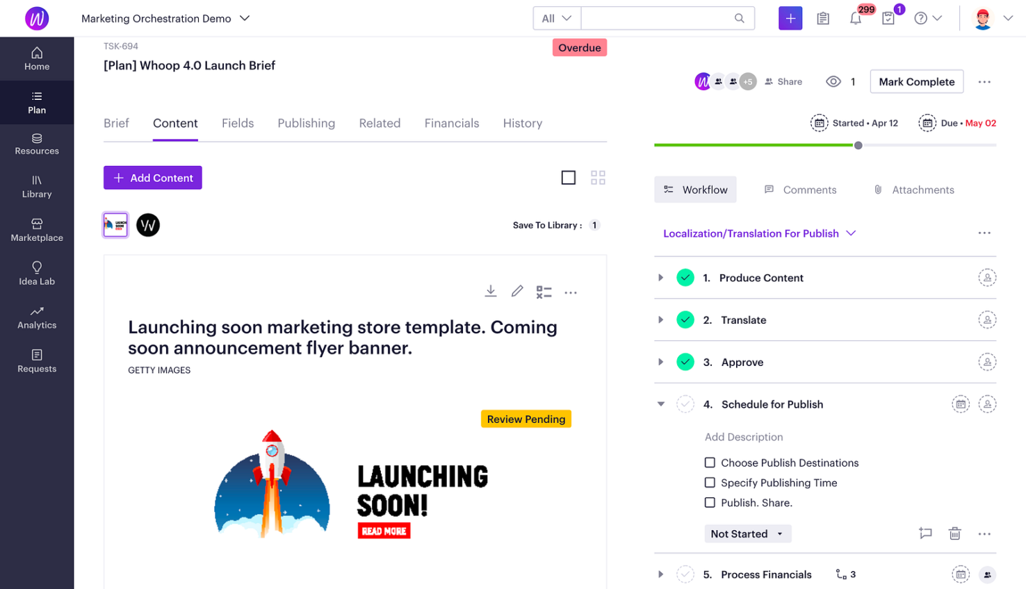
Task
The task page is an essential part of our platform, contributing to over 70% of overall usage. As we delved into the realm of project management, the range of use cases expanded from just content publishing to also include creative and collaborative activities.
With a keen urge to enhance user experience, we’ve introduced substantial modifications. For instance, we relocated the workflow steps from the left side to the right, thereby freeing up the main space for content display. We’ve also structured the page into tabbed segments to lessen cognitive strain, enabling users to concentrate on individual tasks sequentially. In a recent update, the workflow feature underwent a total transformation, making it stronger and more adaptable to different needs. Now, users enjoy features like drag-and-drop functionality, rich-text descriptions, and flexible checklists. Such upgrades have noticeably improved the user interaction on the task page.
The Marketing OS & Onwards
In 2023, Welcome has proudly received distinction as a leader in Gartner’s annual Magic Quadrant for Content Marketing Platforms for an impressive 6th year running. This underscores its consistent performance in a highly competitive space, notably the SaaS industry.
Now operating under the Optimizely umbrella, Welcome takes on an array of design challenges in its bid to cater to diverse use cases. From enterprise to mid-market users, each with unique roles, personas, and objectives, the aim is to meet this varied spectrum of needs. The breadth of user journeys adds to these complexities, underscoring the intricate details of each facet.
Optimizely One was announced during the Opticon 2023. One of the key elements is AI, Opal (see my post).
Product development does not have a quick fix, it’s a constant process to refine and evolve. The key principle remains – keep listening, keep ideating, and keep iterating.
⇒ Opal, the co-pilot experience