

A Humble Learning from Our Recent UI Change
// What we changed, what we heard, and how we adjusted—with empathy.
Recently, we introduced a new search interaction in our platform. It was a small visual change—but one that led to a big user reaction. We thought we were solving for clarity and scalability. Instead, we unintentionally broke a familiar rhythm.
This is a short story about design intention, user trust, and the lessons you learn when you listen after launch.
What We Changed
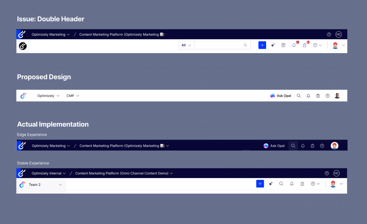
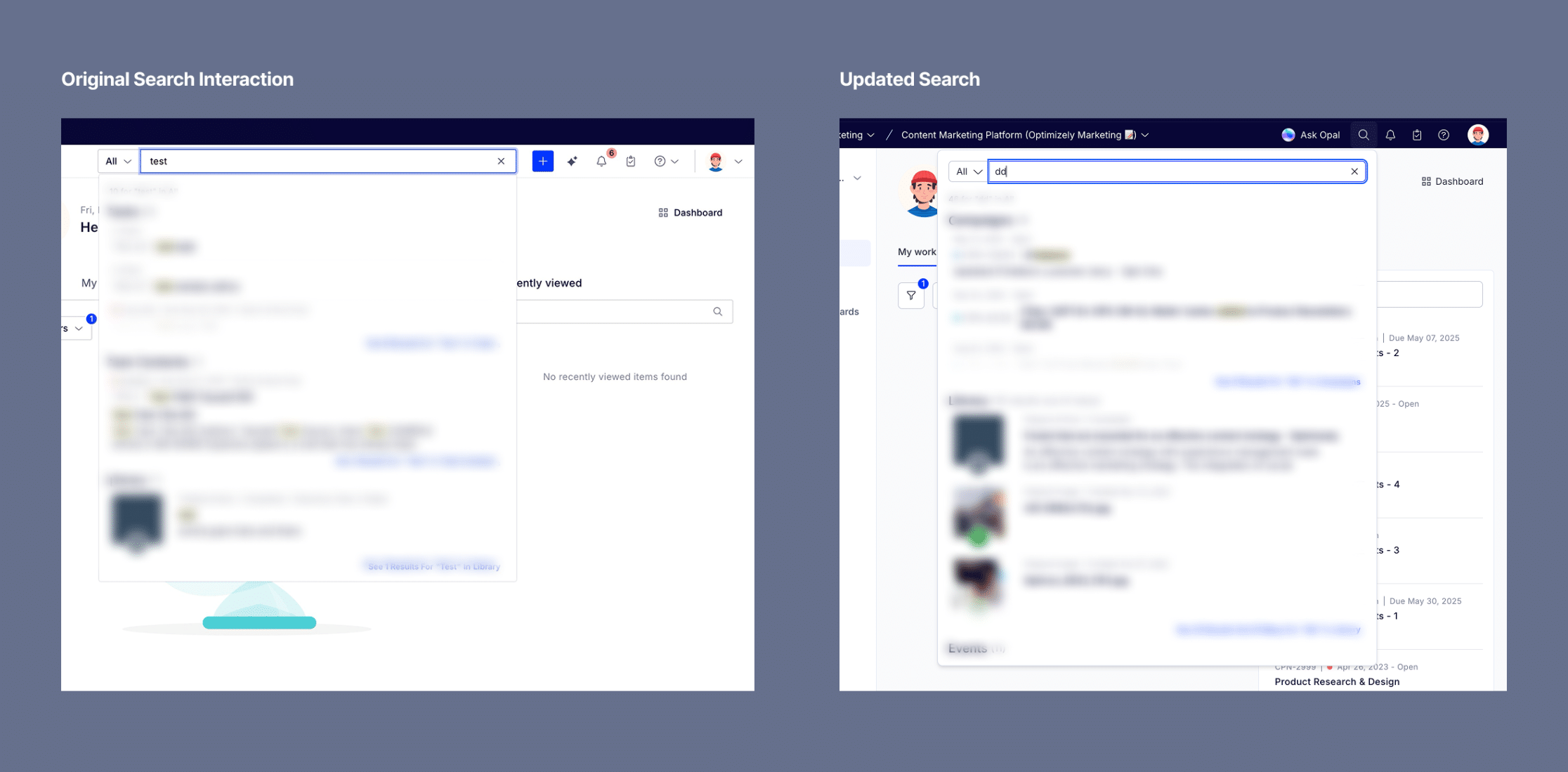
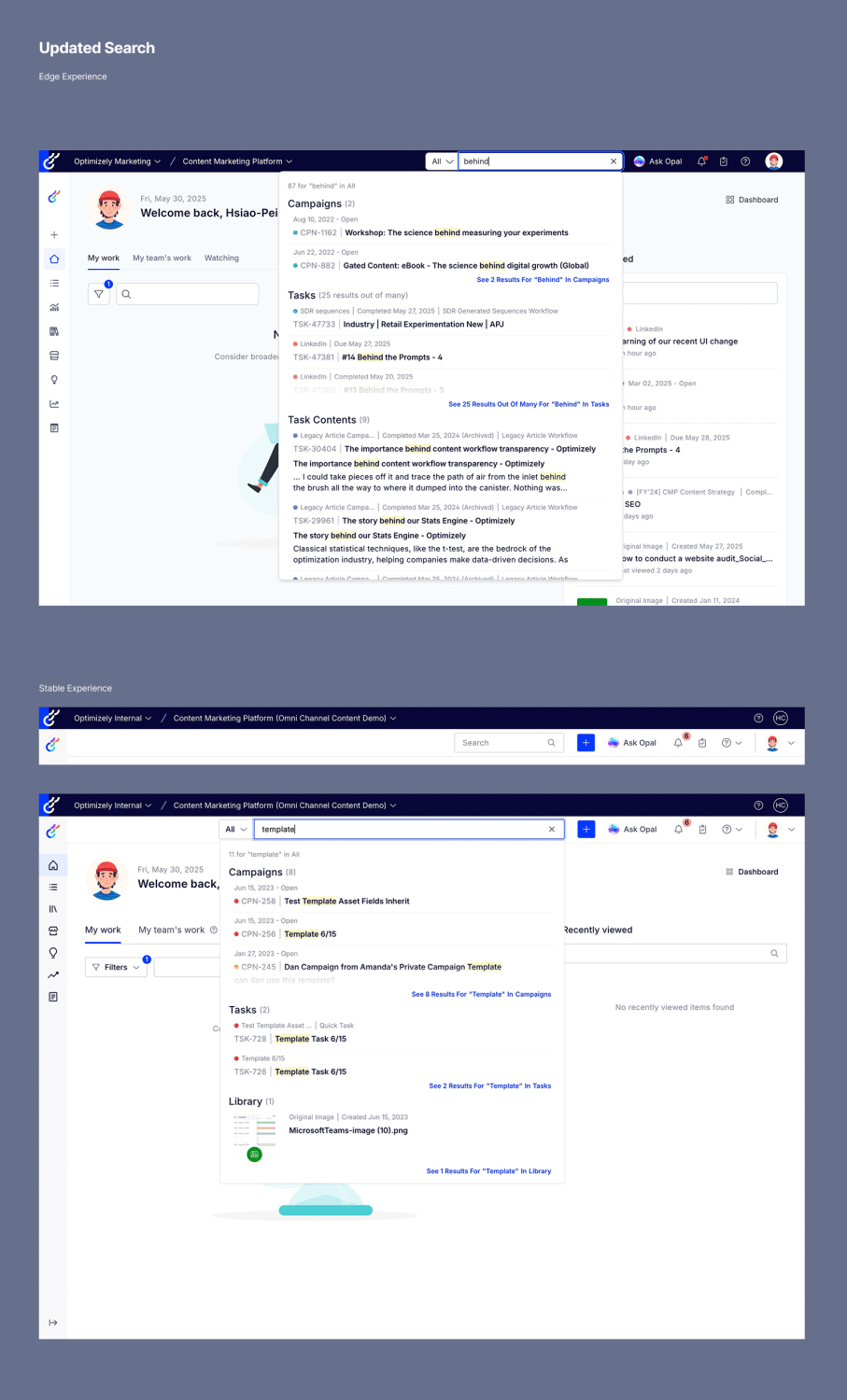
We minimized the search bar in the header, replacing it with a magnifier icon. The search interaction itself—the results, the filters, the modal—remained exactly the same. But the visual cue? It disappeared.
Old design: full-width search input, always visible New design: magnifier icon, tap to expand
Why We Did It
This update was part of a larger effort to align our UI with New Axiom, our new design system—bringing consistency, clarity, and long-term flexibility across products.
But we also had real constraints:
- Double headers – Our Content Marketing Platform had a stacked nav. It was visually heavy and confusing.
- Interim navigation constraints – We haven’t rolled out our new unified nav yet. In the meantime, we rely on a dark header with long dropdowns for switching products and instances. That left us limited real estate.
The compact search icon felt like a clean, modern solution—freeing up space and aligning with industry trends.
But Then… Feedback Rolled In
We heard from users almost immediately:
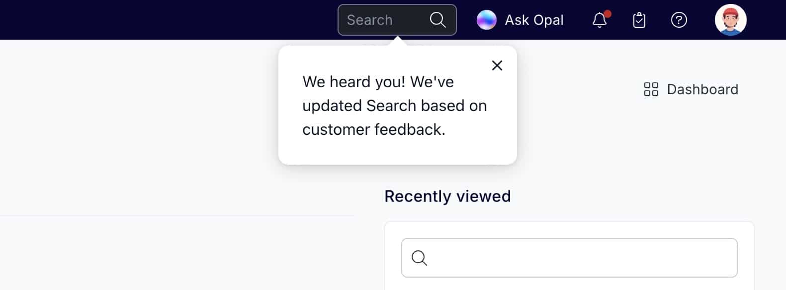
“Bring back the search bar. The search icon being minimized and moved is awful. I NEED a clear search function.”
It didn’t matter that the functionality was untouched. Removing the visual presence of search made it feel gone. When a UI pattern interferes with user expectations—especially for a core action like search—it doesn’t matter how “clean” it looks.
Would Testing Have Caught This?
This wasn’t something we’d likely catch in usability testing.
The interaction technically worked. From a task-based perspective, nothing broke. But something was off—and that only became clear in the flow of real, habitual use.
This was a “caught in the wild” moment—the kind of insight that doesn’t show up in a usability script, but emerges through everyday behavior.
Sometimes the best signal isn’t how users perform a task—it’s how they react when their routine is disrupted.
How We Adjusted
We brought the search input back—smaller, more subtle, but clearly visible. It’s now a bridge between where we were and where we’re going: a gentle nudge toward our future design system, without surprising users too abruptly.
What We Learned
Rolling out a new design system like Axiom means balancing ambition with transition. Even “small” changes—especially to core functions like search—need to respect user rhythm and familiarity.
This experience reminded us that:
- The right pattern in theory still has to earn trust in practice.
- Design systems aren’t just about components—they’re about context.
- Listening post-launch is part of building in public.
Thanks to every user who spoke up. This is how we make Axiom—and our product—better, together.
Posted on LinkedIn on May 30, 2025
#DesignInPublic #UXDesign #AxiomDesignSystem #ProductDesign #OpalAI #SearchUX #DesignRollbacks #DesignReflection